

Jynxie
Member since: 2008So, I'm at this again after the first two fiascoes. Let's see if this time around it goes any better.
I'm creaking a game master's screen here to sell at conventions to my players. One version will be tailored to my group in specific, while another will be more generic (<----basically that means one will have our 'guild' logo on it and one won't).
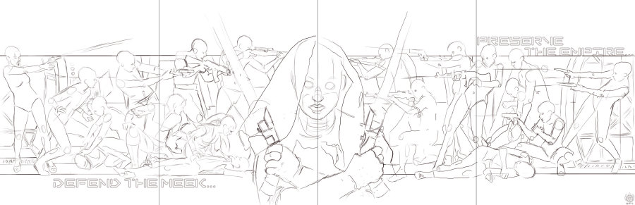
So, here I took my original pencil sketch and brought it up to a nicer layout this time around. The composition works a little better, but I think that it's a bit odd on the left hand side despite playing around with it. I also have been collecting quite a big portfolio of references and stumbled upon this treasure which I share with you http://disparue.org/gallery/movies.php
I still have a ways to go on this piece, such as converting all my mannequins into tangible beings with clothes and weapons.
I am playing around with some concepts concerning this atm. Like, casting the rebel side (the left side) in red from the saber glow on that side, and the Imperials in blue (the right side) to help emphasize a contrast between good and bad. Since the rebels ought to be seen as vigilantes causing civil unrest while the Imperials should be viewed as the good guys (when most see it the other way).
I had done this in mixed media twice before now to size (which were both ruined). It seems more feasible to do it digitally this time (and cheaper).
I'll update this as well as my main blog on blogspot as I go along.
12-20-10
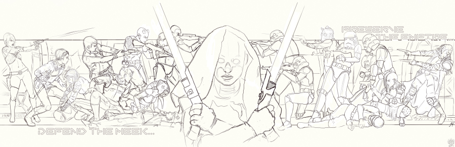
An update today.....I finished the pencils!!!!!!!!!!!
I had added in some ties and x-wings in the glow of the sabers but felt it threw my composition off so I took them out of there. This is gonna be one epic rendering. I hope my laptop can handle it.
Comments
Wooooooooooooooooooooooowwwwwwwwwwwwww!!!!!!!!!
That is just Awwwweeeessssooooommmmeeee!!!!
~LCT
Kia kaha
Hot damn that is cool!
Boshuda
Thanks guys, this is on it's way to being my largest portfolio piece. Should be up for sail shortly after I finish (whenever that is)
This is already looking epic!! Can't wait to see the final product!
What a massive undertaking you've embarked upon!
You have NO idea!
Moving along to a grey tone comp to figure out lighting, then some color studies. I haven't made much use of color studies since I tend to stick with pallets I know and love, but there are a lot of potential things that can go wrong still.
Some worries are that the right side will have too much white with the troopers, and too much dark or color in the rebels. Also the play of the light the sabers will be casting can be an issue.
Inspiration for this piece aside from an epic portfolio addition and my game group wanting these is Tommy Lee Edwards' art. Hoping to keep rocking on with this...no idea how long that will take as the pencil has taken me around 2 weeks!
Haha! I can't say I've ever undertaken a project like this before, especially with so many figures, but I certainly do have a huge amount of respect and appreciation for what you've achieved even to this point!
Speaking purely as a self-taught amateur, though, are the sabers going to be the same colour? Because that could probably work reeeeaally well to your advantage when it comes to unifying the piece! Perhaps a gratuitous amount of bright white hilights (from 'blaster bolts'?) could help balance things out on the rebel side...
Though more than likely you've already thought through a million possible ways to handle this. XD However you end up tackling it, know that I will be watching this come to life VEEEERY eagerly! :D
I may not have the training to know what techs youare useing, but I do know what I like to see. This is going super well and is very oprganized. Judging from the raw talet you have as well this should be epic.
This is staggeringly cool - can't wait to see it done! Love those curved handle light sabers the centre character is holding. I don't think you need to worry about too much white in the troopers on the right - maybe include some highlight colours from the background in them to keep the white toned down if necessary?