

NJO: The Last Stand of Eelysa
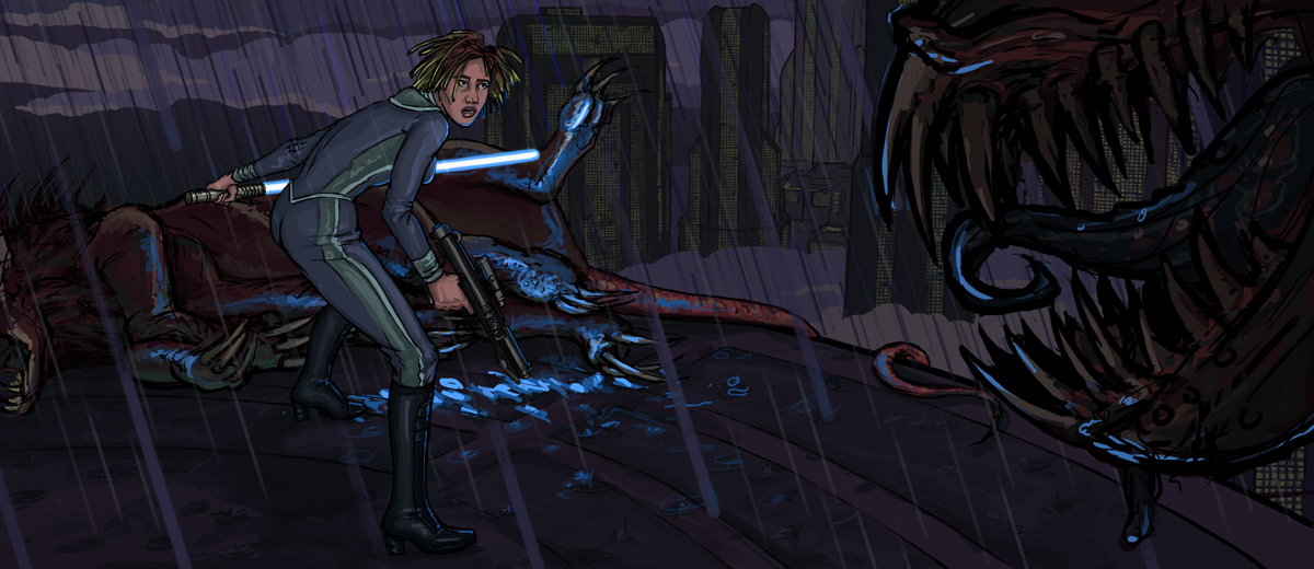
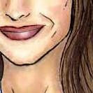
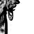
Here's another illustration I did from the New Jedi Order, depicting Jedi Master Eelysa before she was killed. In "Star by Star" Eelysa's Jedi students sense her fall victim to the Yuuzhan Vong's voxyn.
I based Eelysa's outfit from "Revenge of the Sith" concept art.

More Mazzic awesomeness!
I swear, if I knew how to draw, I'd start posting under "Talon Karrde", just so we'd get the smuggler's alliance going. :)
Once again you've managed to grasp the more realistic and dark, violent tones of the Nej Jedi Order-era. The blue light of the blade reflecting off of the voxyn blood is a nice touch, too.
I also like the composition and the narrown/wide aspect of the image. Reminds me of the 16:9 aspect ratio, which - to me - is very cinematic. Do you have any high rez versions of this? It'd rock as a wallpaper on a wide screen.
http://swagonline.net/node/4346
Really nice dark gloomy scene there! Raining too! Definitely powerful atmospherics.
Jace.Terrik - If your curious about res the pic would have to be to fit a 1680x1050 or 1920x1200 lcd widescreen...
a standard 4:3 screen resolution of 1024x768 is a 1.33 image aspect ratio.
A 22" lcd monitor widescreen of 1680x1050 is a 1.60 image aspect ratio.
A 24" lcd monitor widescreen of 1920x1200 is also a 1.60 image aspect ratio
814x353 is a 2.31 aspect ratio... a higher resolution image of this pic to fit it to 1680x1050 wallpaper size would come out to 1680x728 , thus a 161 pixel black bar height both top and bottom (for the difference of 322 pixels) would be required to top of the image height to a full 1050 pixels.
Likewise 1920x832 with black top & bottom bars of 184 pixels thick (368 pixels difference from 1200)
I agree, a widescreen wallpaper would be nice. Too bad SWAG doesn't support greater than 814x814 image gallery sizes. (anything larger than that gets automatically reduced down to the nearest width or height of 814)
A slight critique however on lighting effect: the lightsaber illumination on the dead Voxyn's body and blood is spot on, but the blueish highlights on the living / approaching Voxyn's jaw looks off... Its the angle and the way the Voxyn's facing, I don't see how there could be blueish lightsaber highlights. This is like the backside facing away from the lightsaber. Its just the way the jaw is angled / facing - pointed purely from right to left side profile rather than directed towards the Jedi & lightsaber.
Please Mazzic, the critique isn't meant to be harsh, or slamming the image. Its just a minor thing. Its still a stellar image.
That said, I still like this piece :)
________________________
Core to the Quad baby!!!
If your going to complement me, don't tell me my work is neat, cool or awesome. If you really like it, tell me why you like it and what you like about it. Only then I'll take it as a complement.
I don't want to be contradictory TNJ, but I like the highlights on the creature's jaw. I think without them, the creature would fade into obscurity in the shadows of the foreground. Putting highlights brings him into our focus and makes him a more active part of the scene.
Boshuda
Thanks for the comments!
Order 66 has been documented and shown...I thought it would be nice to pay tribute to the Jedi that died during the Yuuzhan Vong War. A lot of really cool, obscure Jedi died during these dark times. The New Jedi Order had a very different tone than Order 66, so it's been fun trying to get across the tone of the series.
TNJadeonar, you're right about the incorrect angle of the lightsaber reflection on the voxyn's muzzle. It shouldn't be to the side like that, but more to the front. Asok, it does make it "pop" a little more...but inaccurately, unfortunately. Maybe I can do a bit more backlighting on the teeth to achieve the same effect. I have a friend collaborating with me on a project that will combine these Last Stands...so there's always time for more edits. :)
Thanks for the crits! Keep 'em coming!
Mazz
I like the highlight on the jaws (don't hit me TNJ!).
I felt that Order 66 just kind of came out of nowhere. I don't want to start a war about what's good and what's bad, but the writing in the prequels weren't up to par with the original trilogy.
Therefore, the death of certain characters in NJO - especially Anakin Solo, who was (and still is!) my favorite character - packed a much more considerable punch in terms of drama and loss than the death of Plo Koon, for instance.
I also want to thank you, TNJ, for the info on the aspect ratio-stuff!
http://swagonline.net/node/4346
Nah, I won't hit ya Jace. ;) Its mainly a difference between artistic and realism. Artistically, lots of you like it like that, whereas my observation and critique was based on realisim - where the light source is and where / where its not supposed to highlight. I'm into 3d rendered art, so the difference in lighting and shadow can really change a scene.
I'm working on a character pic or two and scene, I probably should do a WIP blog for it... Then I'll be getting critique on it too ;)
The image aspect ratio stuff is pretty simple... I'll how you how to figure it out. Divide 1024 by 768 gives you 1.3333333 and thats the image aspect ratio.
To find out how well an image scaled to fit your desktop wallpaper, and if there will be any black bars - and how thick... You just divide the currant image's width by its height to get the aspect ratio. Then take your desktop's screen resolution - the width, and divide it by the aspect ratio of the image your looking at.
The difference of image height, divide that in half and that'll be the black bar space for top and bottom.
This works for both width or height. Whichever is the larger measurement. It comes in handy to know when you gotta do the math manually to code html to resize images or display as thumbnails. It also explains why some widescreen movies still have black bars on widescreen tv's. (High Def tv's are usually either 1366x768 or 1920x1080).
Microsoft would do well to learn a thing or two about aspect ratios. Desktop wallpaper only has 3 options - Center, Tile, or Stretch - which distorts any pic to fill the screen. Had there been aspect ratio acounted for, it'd scale up the image to best fit, while keeping proportional to the original. Thats a pet peeve of mine, having to manually letterbox images in photoshop when I want a change of wallpaper thats not native aspect ratio or resolution as my monitor. Knowing how to calculate aspect ratio saves me the time and effort of having to hassle with photoshop to find out. (saves several repetitive steps should I like the pic enough to want it as wallpaper.)
________________________
Core to the Quad baby!!!
If your going to complement me, don't tell me my work is neat, cool or awesome. If you really like it, tell me why you like it and what you like about it. Only then I'll take it as a complement.
"Microsoft would do well to learn a thing or two about aspect ratios.... Thats a pet peeve of mine, having to manually letterbox images in photoshop when I want a change of wallpaper thats not native aspect ratio or resolution as my monitor."
Here, here! I second that. And yes, I too have to do the exact same thing and I like to change my desktop wallpaper ALOT!
http://swagonline.net/node/4346
a higher resolution image of this pic to fit it to 1680x1050 wallpaper size would come out to 1680x728
-------------
GoDaddy.com coupon codes
Target coupon codes
Sony Style coupon codes
Pugster coupon codes
Adobe coupon codes
Sears coupon codes