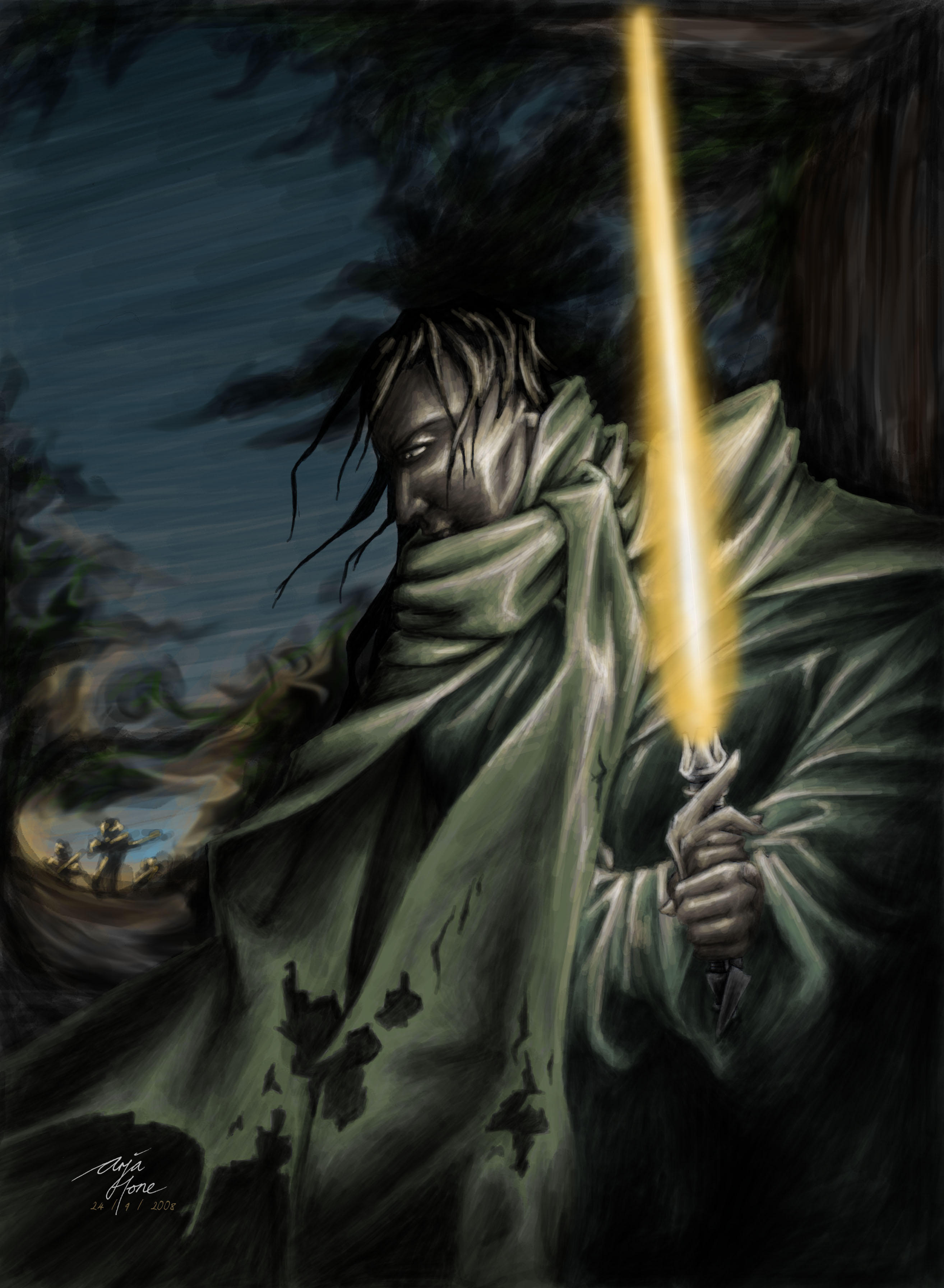
Cloaked Jedi
Okay, so here it is - my attempt at a picture without lines. Or at least, I've drawn over the lines of the original sketch. I don't know how good it is, but I thought I'd put it out there as something a bit different from my usual. I think I need to keep working at it, but it's not too bad for a first attempt...
Hmmm...



Wow! This is a very nice piece from you, I have to admit. The general character design follows your style, but the artwork - how you've illustrated him - is something completely new. Simplistic but powerful, it illustrates that less is more. Also, the artwork is just that; I could see this thing on a canvas, hanging over a mantlepiece.
My only complaint is how the topmost of the hands seems to have an extra - and inverted - digit. Or it just seems distorted, somehow.
In conclusion: keep up the good work. You're obviously growing in artistic expertise, but you're also taking your talent in new and interesting directions with pieces such as these.
"Cut to the cheese already!"
I seconded Jace.Terrick's remarked. Quite astonishing.
-LC :-)
Well done, I really like this one. The use of light is very good
Thanks guys! I'm glad you like it!
I've got another one coming, it's just clearing to gallery now from yesterday. I think I'm gonna keep working at this style and see if I can't make it work!
Yeah, I agree, Jace - what would be his left ring finger seems disfigured. I made a bit of a mess of where the hands' knuckles were, so now it looks like the ring finger doesn't have one. Irritating! Ah well, these things we learn along the way...
Anyway, cheers all!
~ Mercy
All I have to say is, VERY nice work Mercy. It captures a moment in time, with passion and feeling to it.. And I LOVE The saber... ((looks a lot like the one you ditched in the other picture, because you forgot)) Love the feeling of the picture, and the smooth flow of it really does speak loudly. Keep up the wonderful artwork.
Cool, man! I don't know what to say, except ... thanks! That's really lovely!
I love the style of this piece. More a painting than a drawing. Excellent use of definition, without "cartoon lines".
I agree the top two fingers could have used a little more definition...they look too webbed, but that's a small criticism in an otherwise lovely piece. It's my background now!
Phyrefli
Neat! Thanks darl, that's so cool!